Given real-life data from the Federal Aviation Administration, I was looking to see if I could uncover why certain airports were more delayed than others.
Lessons Learned:
- Using unsupervised learning techniques can be daunting at first, but having a clear game plan to address the data to answer your prime objective makes it very easy
- PCA is magical! This data set had a lot of overlapping metrics that were unwieldy to manage, but with dimensionality reduction techniques, it all came together.
The Data
Given Dataset
3 datasets were given, consisting of:
- Airport Details: composed of the geographic features of airports
- Airport Cancellations: detailed information of cancellations and diversions of airports from 2004 - 2014
- Airport Operations: even more detailed information around delay/cancellation metrics with 10+ features related to delays. Also includes total flights taken. All info was also was from 2004 - 2014.
For this task, the Airport Operations dataset was treated as the primary set of data. All other sets were merged with the primary one, given its relative wealth of information.
Risks/Assumptions
Each airport and year were treated as individual observations.
There were a few data points that were dropped as a result of merging data sets. This included airports GYY, TEB, and VNY, which did not appear in the Airport Cancellations set. Given that imputing the data was too risky, and that the data was not location specific, these airports were left off.
Furthermore, 2 airports were missing a few years of data, including PSP and SMF. Since each year was treated as an individual point, these were left as is.
The biggest risk with the dataset was overlapping features:
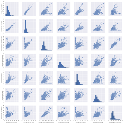
- MOST URGENT: As noted above, the Airport Operations dataset had nearly 10 features denoting various iterations of a “delay”. The pairplot below shows some of the potential issues with choosing a single target variable as a “delay”, given the correlations between each of these features. This issue would require a larger method to amend.
- URGENT: Geography also overlapped as well. Airport details included FAA Region, County, City and State. Given potential collinearity, these would also have to be dealt with.
- KIND OF URGENT: There were also data points that provided metrics for both arrival and departures (resulting in nearly 1-to-1 correlated features). Only one of these was needed, so Arrivals was deleted to avoid collinearity.
The Approach
A 2 part approach was implemented to amend the data issues listed above:
Part 1: Hone in on “Delays”
The goal of this part was to identify which overlapping feature(s) was the most salient in defining a delay. This was done by:
- Reducing overlapping “delay” features through PCA
- Outline which features contributed the most to the PCA
- Utilize the PCA to cluster each individual airport/year to draw larger macro trends
Part 2: Understand “Delay” Causes
Utilizing results from Part 1, the goal of Part 2 was to understand what other causes contributed to the larger “delay” metric:
- Reconfigure merged dataset with identified clusters from Part 1
- Identify which of the remaining features contribute the most to “delays”
The Findings
Part 1: Hone in on “Delays”
After implementing PCA on the overlapping “delay” features, the optimal number of components was 3, with a culmulative explained variance of 84.9: 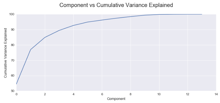
When the correlations between each of the 3 PCs and the overlapping “delay” features was examined, it seemed nearly all the features had equal importance for PC 1, as predicted. 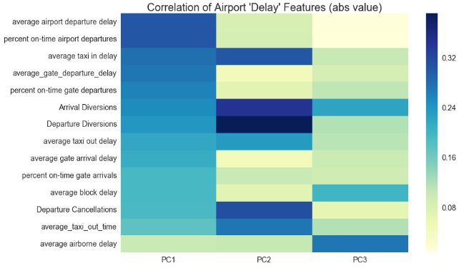
However, Average Airport Departure Delay and Percent On-Time Airport Departures were slightly more salient for PC 1 vs the the other features.
Using the PCA, and implementing KMeans, two distinct clusters were identified, with a Silhouette Score of .44:
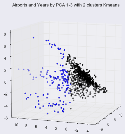
With a relatively low silhouette score, the data could be further refined to increase the distance between clusters, but for the sake of this analysis, these 2 clusters were used to move forward with Part 2.
Part 2: Understand “Delay” Causes
With 2 key clusters of airports and years based off of a newly formed “delay” metric, the next step was to identify the features that drove the categorization of these clusters.
A Random Forest Classifer was ran against the two clusters for Year, Geo (City, State and FAA Region), and Total Flights.
The best performing model had a cross-validated accuracy score of .91 using FAA region, solving one of the data discpreancies noted above. The model also produced the following feature importances:
| Feature | Relative Importance |
|---|---|
| Total Departures | .731 |
| Year | .116 |
| FAA: AEA (Eastern) | .070 |
| FAA: AWP (West) | .019 |
| FAA: AGL (Great Lakes) | .018 |
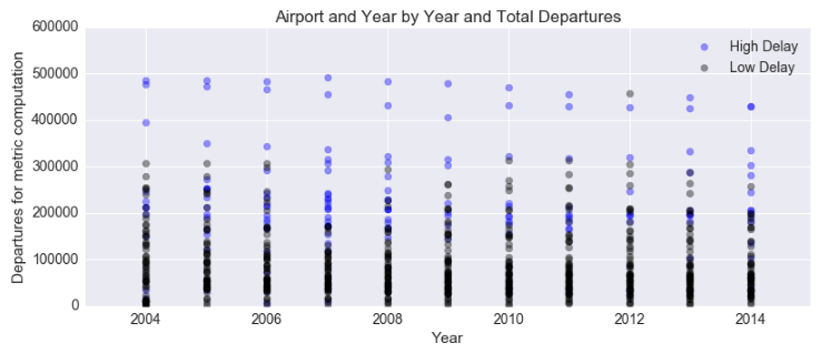
Feature importances denote that the total volume of flights coming out of an airport is the most important factor in determining the airports with the most delays.
High Delay airports tend to have more flights, vs Low Delay flights. Higher volume definitely contributes to more delays.
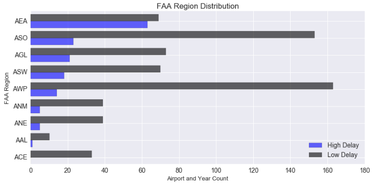
Differences between High and Low delay airports also become apparent when examining regions. High Delay airports are concenterated in the Eastern area (AEA), whereas lower ones are represented in the West coast (AWP).
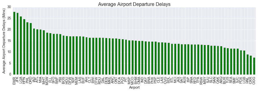
This becomes apparent when we examine the airports with the highest average airport departure delays, as the top 3 airports are located in AEA.
Closing Thoughts
From a technical implementation stand point, this was the first time that I implemented a PCA, and it proved to be very effective in reducing the collinearity of the given features!
From an analysis standpoint, its really unsurprising that airports that have a higher amount of total departures are the ones that are the most likely to be categorized as a high delay airport. But, airports like ATL, which has one of the highest volumes of airport traffic, aren’t consistently categorized as a high delay airport.
Region matters a lot! EWR and JFK are fairly consistently categorized as high delay airports through out the years. They both definitely handle less volume than an airport like ATL but they are still plagued with the highest delays.
More information from the FAA would definitely bolster this analysis. What else is there about the northeast region that is causing these delays? Is it uncertainty in weather, compared to more fairweather places like ATL? Could it be that there are more flights from Europe that are throwing off the flight departures and arrivals?
As always, feel free to take a look at the full code here
That’s all for now!